Why is the Spine Model visualised the way it is?
There were many iterations of drawing out the Spine Model. Here is one of the earliest drawings…
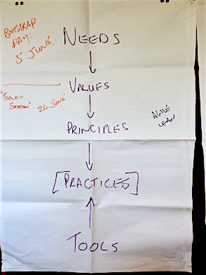
Square brackets were drawn around Practices, because that is where people seemed to get fixated on, and they needed to lift up to a higher level. Over time we started to leave that detail out.
We spent a lot of time talking about the direction of the arrows and what they meant. It seemed very important. Over time we started to draw them all going down, and then we’d forget that and started drawing them going up sometimes…eventually we realised that it depended on the context and the conversation we wanted to have. There is no inherent linearness to any of the levels or movement between them. So now we leave the arrows out of the official drawing, but in conversation we often draw them as appropriate for the kind of map we are making.
Today, this is the official image for the model:
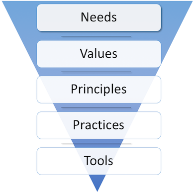
Each aspect of it is chosen with intent to convey a meaning.
Needs are at the top because it is the most important, and people tend to model importance from top down. Arrows have been replaced by a thin black line between the levels that is simply meant to add to the visual appearance of the levels forming a spinal column (see why “Spine” Model).
The solid triangle behind the levels represents the fact that although we make a distinction between the levels for mapping purposes, in reality they are inextricably overlapping and intertwined. For example, from one perspective something could be a mapped as a Value, and from another that same thing could be a Need.
The width of the triangle from top to bottom represents the speed at which things change at that level. At Needs level the rate of change is slow. At levels further down, the rate of change speeds up.